
 The last two weeks I covered how this idea of making a coloring book of my book covers came about and the legal issues all authors must address in order to do such a project. This week and next, April Martinez, my fabulous cover artist and the person who created my coloring book, will talk about her process.
Creating the Illustrations
When Moni came to me about a coloring book for her, I’d already been mulling over the best way to convert existing cover art into coloring book line art.
Last year, my fellow cover artists and I were discussing how the popularity of coloring books has worked its way even into the romance industry — one New York publisher had already turned their cover art into black and white illustrations that their readers could color, and smaller publishers were considering doing the same. So, when the topic of Photoshop tips and tricks came up, we cover artists began to look for a quick and easy way to turn photo-manipulated cover designs into simpler line drawings. We shared among ourselves links to videos and how-to blogs, debating over the best way to do this.
I was skeptical of all the methods, though, even of the ones I’d shared or developed myself.
See … the thing is, there is no quick and easy way to turn a photo-based image into line art that a colorist would actually want to color.
The best you might be able to create with a few Photoshop tricks is something that looks like a realistic pencil drawing or a textured and artfully done pen and ink illustration. It is not, however, something a coloring book enthusiast would necessarily want to color.

Some Amazon Reviews on Gray Scale Coloring Books
Why is this?
Well … if you look at a coloring book illustration, especially in a popular coloring book, the artwork is fairly simple and spartan. By “simple,” I don’t mean anything like stick figures and children’s drawings; I mean that the artwork is typically uncluttered by textures, highlights, shadows, and details that might add depth to the drawing. It is crisp black ink on clean white paper, no gradations of color such as grays to add shading or 3D shape to the representation on the page. If you think about it, a coloring book illustration is actually quite an abstract version of whatever it’s supposed to be. It’s almost a written language, the world laid down in symbols of black markings, a simple line drawing meant to communicate with uncomplicated brevity a universe of much deeper meaning.
The colorists, mind you, are meant to add all that texture and meaning to the illustration themselves. It is their purpose to give shape and color to the line art, like adding muscles, fat, and skin to a skeletal framework.
So … using a Photoshop trick to turn something into line art doesn’t necessarily work because a Photoshop trick will merely take all the detail in a photo-based image and translate it into black or gray pixels — i.e., turn it into a grayscale image. If there is a lot of texture and grain, or a lot of gradations of color and shadow, Photoshop won’t know how to translate that into its barest form — i.e., solid outlines, the most basic language that a human colorist can understand and work with. It just won’t know what to keep and what to throw out, at least not as well as a human mind could.
This is especially the case when the artwork you want to convert is a beautifully textured image, artfully lit, fading one element into another in a pleasing montage-like collage. In fact, the result is often just too finished or too busy to do anything more with it. It might be utterly beautiful in its detail, but a colorist looks at that and thinks, “That’s not something I can color.” They may not even want to. Why bother? There’s no room for their own interpretation.
So, when Moni came to me, not only had I already weighed the pros and cons of each Photoshop trick I’d come across or developed, but I had also already seen some Amazon reviews on coloring books created in this quick and easy way (see above) — and I had already learned a few things in creating my own coloring book, which I’d created from scratch with no Photoshop filters. I decided then that Moni’s coloring book would be a good opportunity for me to really test my own theories on this.
And here is what I did:
1. The quick-and-easy Photoshop conversion
Moni gave me four titles to work with, the first being Prime Imperative. This being my first attempt at converting one of my covers into a coloring book illustration, I decided to give some Photoshop methods a good college try.
False modesty aside, I have “mad skills” in Photoshop — über-mad skills — and I’ve written the tutorials to prove it. None of the YouTube videos people recommended were revelations to me; I already knew most of the tricks. Yet … I couldn’t find a single way in Photoshop to turn Prime Imperative into simple line art that someone would want to color.
Not only did I try multiple ways, but I also combined a number of different ways to try to get the best result. Parts and pieces of the image that already had good contrast and large expanses of color, I did in one way. Other parts and pieces that had a complex gradation of colors and a lot of detail, I did in another way. I did a lot of versions. I did them in layers. I did them in stages, and I did them with the different settings and options tweaked. It was one giant trial-and-error session that proved to me that the “quick-and-easy” way was far from quick and far from easy.
The very best I could come up with was this:

PhotoShop Method, (c) 2016, Graphicfantastic, All Rights Reserved.
2. The time-consuming hand-drawn method
By this point, I’d figured drawing the illustration by hand would take less time and yield better results. I was wrong about the time, but I was right about the results.
I imported the cover art into, not Photoshop, but Illustrator, and I imported it as a template. I then used the pen or pencil tool — anything with a 1pt. stroke, really — and actually traced the lines in the artwork. Given the detail in the artwork, it was as time-consuming as one might expect it to be, probably more than a full day’s work, maybe 8-10 hours with a Wacom pen and tablet, simply laying down line by line, using my human brain to decide what to outline and what to leave out.
For an artist like me more accustomed to working with stock photos and Photoshop tools, the work seemed overly slow and tedious. Despite my early experience with hand-drawn art, I’d gotten way too used to the instant gratification of photo-manipulated work. So I was practically brain-dead by the time I finished.
But I was relieved to finally be able to send Moni the two experiments — the Photoshop-converted version and this hand-drawn version:
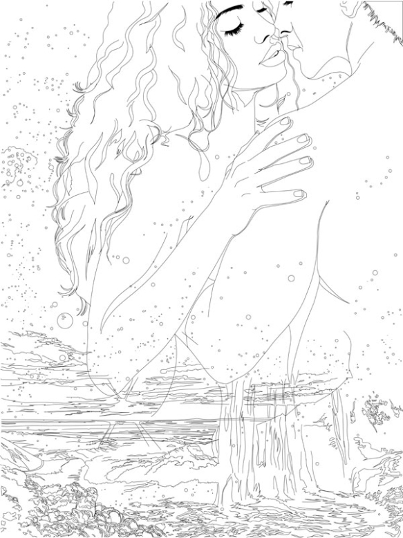
Hand-drawn Method (c) 2016, Graphicfantastic, All Rights Reserved.
Which of these two would you color? If you’re anything like me, you’d prefer the second one; there’s just more room for interpretation.
This made me cringe as an artist trying to make a living, though. Creating a coloring book illustration by hand is just so much work. I would have to charge a full day’s pay for each drawing, at least, and who would want to pay that? Oy.
But the hand-drawn version really did end up being the better one, so I did the other three by hand as well.
*********
I loved the results April produced with the hand-drawn method.
Next week, April will be back and discuss the laying out of the coloring book, which includes the amazing front and back covers.
